ShopDreamUp AI ArtDreamUp
Deviation Actions


Suggested Deviants


Suggested Collections


You Might Like…


Featured in Groups


Description
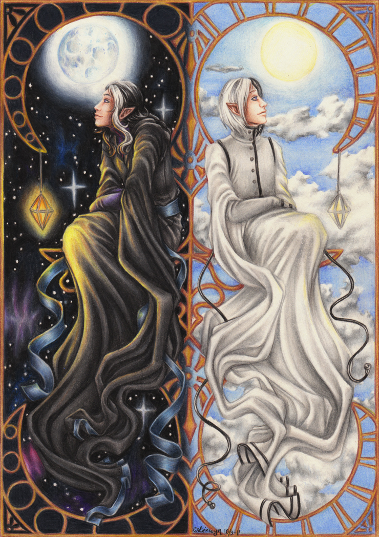
BAH!
Finished!
This was supposed to be for #OC-Challenge's theme Night and Day but I didn't manage to finish on time
I continued to work with it though because this is a picture I've been wanting to draw for over five years... and now I finally got a chance to do it ^_^
It's my characters Zeithan and Denar Callath Eleninque and they're twins. Oh yeah.
Why I wanted to draw them for this theme is simply because they ARE like night and day.
Denar is kind and calm while Zeithan is impulsive and... pretty nasty x'D
Denar eats a lot, Zeithan doesn't. Zeithan sleeps a lot, Denar doesn't. Zeithan has a good memory, Denar doesn't. Denar can dance, Zeithan can't. Denar is gay, Zeithan is straight. Denar draws and sculpts, Zeithan can draw stick men at best. Zeithan sings and play instruments, Denar might as well have been strangling a cat when he tries. Denar likes ketchup, Zeithan likes mustard.
I mean... COME ON
So I've always wanted to draw them representing day and night.
They're actually the first characters I ever created and Zeithan still holds the place as my absolute favourite ever.
So... yeah.
I decided to draw this and somewhere along the way I seemed to have decided that no line art was a good idea... and flowing fabric was fun and... BLEH =___=
It was difficult to say the least but I like the result, so I hope that you will as well ^_^
I'm particularly proud of all the fabric and folds
Enjoy!
Zeithan and Denar
Image size
740x1048px 611.24 KB
© 2011 - 2024 Lienwyn
Comments88
Join the community to add your comment. Already a deviant? Log In
And here we have yet another piece of fond memories.
It's beautiful, and all those folds are simply amazing. Also, so many details which are similar yet different for the two! Like the frame. I like that a lot. And the fact that neither of the halves feels more prominent. I think that normally the darker part would draw the eye more than the light one, but it's not the case here - perhaps because both halves are rather busy and detailed (Smile)") And I like how the cloth of their sleeves flows not mirroring each other but actually almost parallel there in the middle of the picture. I think it also helps to keep the picture together visually.
And I like how the cloth of their sleeves flows not mirroring each other but actually almost parallel there in the middle of the picture. I think it also helps to keep the picture together visually.
Mustard vs. ketchup! That was the final difference that convinced me they are polar opposites.
It's beautiful, and all those folds are simply amazing. Also, so many details which are similar yet different for the two! Like the frame. I like that a lot. And the fact that neither of the halves feels more prominent. I think that normally the darker part would draw the eye more than the light one, but it's not the case here - perhaps because both halves are rather busy and detailed
Mustard vs. ketchup! That was the final difference that convinced me they are polar opposites.